- HOME ›
- How to use props
Using props (visual aids) well in speeches
10 tips, (and more), to enhance your presentation with visual aids
By: Susan Dugdale
Props (aka visual aids) used well make it easier for a presenter to deliver their message effectively and for the audience to receive it. They add variety and interest to a speech.
When you 'show' as well as 'tell' an audience is more likely to be engaged, to understand and, importantly, to remember what you share.
What's on this page
- props or visual aids from the point of view (POV) of an audience
- the benefits of using props
- the pros and cons of using visual aids
- 10 tips on using visual aids well
Think about using props from your audience's POV
Which of these alternatives is more effective from your audience's point of view (POV)?
If I were giving a presentation on my working holiday in Russia, and you were sitting in the audience, would you prefer to simply hear about it?
Or would you rather hear about it AND see a few carefully chosen photographs, along with a few Russian souvenirs?
The 'hear and see' option wins hands down.
(The photos were taken during a visit to Russia to teach a course for Russian English teachers on teaching English. It was a fantastic experience, and sadly, given the current situation, one that could not happen now.)

Here's one more example.
Imagine explaining something like the current weather patterns, or the fluctuation of the US dollar over the past year without using visual aids. No diagrams. No graphs.
It's tough. It's not impossible, but it is definitely a challenge.
When you use good visual aids as part of your speech, you are giving your audience so much more. They add value to your presentation.
The benefits of using visual aids are:
Clarity
You reduce the number of words you have to use to explain a concept or describe an event.
Remember that old saying, 'a picture is worth a thousand words'?
Now think of the work a well-drawn graph or diagram does. Or what an aptly chosen graphic or photograph does to show an event.
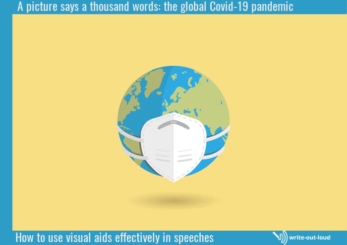
The image below by cromaconceptovisual from Pixabay sums up the recent global Covid-19 situation succinctly.
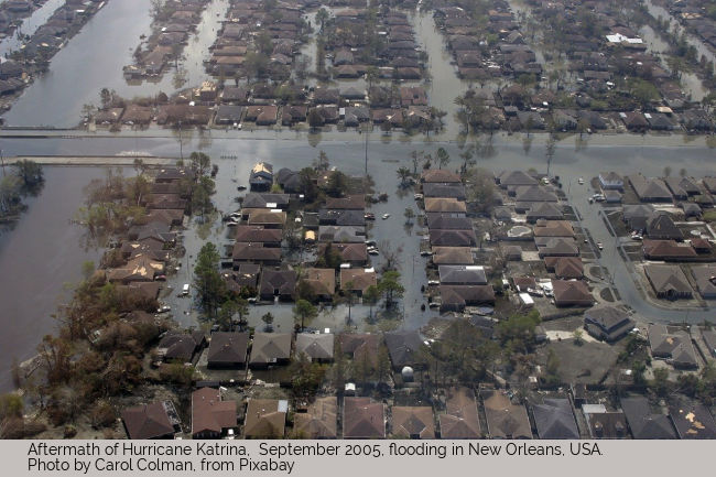
Similarly the Hurricane Katrina picture below it doesn't need words. The devastation wrought by the winds and flooding is obvious. We see it and in seeing, understand and feel it.
Credibility
You become more believable through your audience 'seeing' something to reinforce your words.
Another old saying says it for us like this: 'seeing is believing'. When we add 'showing' to 'telling' effectively our credibility rating soars.
Use what will work for your topic, purpose, audience and space to back you words, to add proof. It could be personal photographs, like the ones from my trip to Russia. It could be an info-graphic, a video clip ...
Does every speech need props or visual aids to make it effective?
The short answer is, no.
The longer answer is to consider carefully the nature of the speech you're preparing and its content.
Ask yourself: what could I show (or demonstrate) that would add value for my audience?
Obviously, your answers will vary hugely.
Do add any time or financial constraints into your decision making process. It takes time to gather together and prepare effective visual aids. It may take money as well.
Weigh up the pros and cons before going ahead.
If you don't have time, simplify your plans. It is better to have a few simple well presented visual aids than a grand incomplete scheme.
You may even decide that this time, props are not for you and modify your topic accordingly.
What can I use as a prop or a visual aid?
Absolutely anything at all!
However there are pros and cons. Before you get too excited consider:
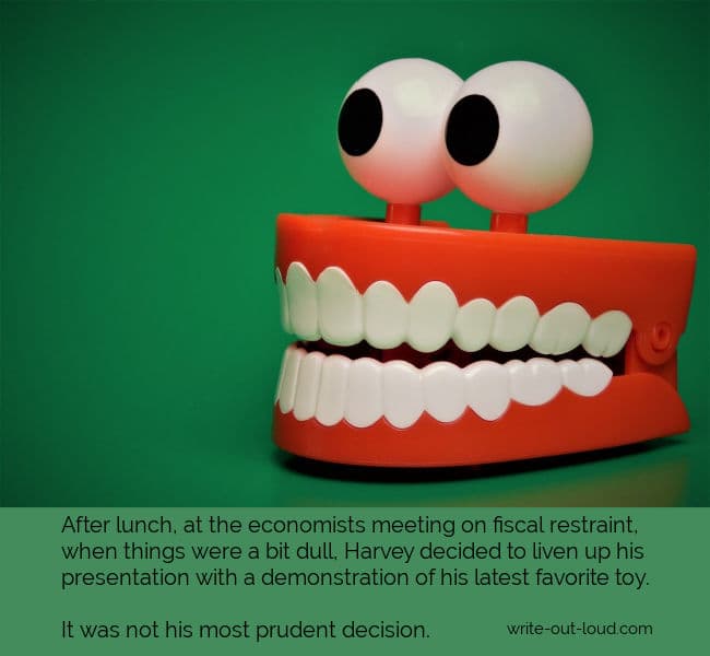
- whether or not your intended visual aid fits your topic. Something brought along merely because its interesting, or a novelty, needs to be left at home.
A visual aid should support the purpose and content of your speech. If it doesn't, it is irrelevant and could undermine your credibility as a speaker.
- the suitability of the prop for your audience. Think carefully before showing shocking photographs or any material that may offend, even if it fits the theme of your speech.
- the monetary value of the prop. Some things are too valuable to shift around without making the necessary arrangements with your insurance company. If you are willing to do that, good. If not, perhaps photographs or a video will suffice.
- the emotional value of the prop. Are you willing to take responsibility for having either your, or somebody else's, very special items on show?
- the suitability of your prop in the venue you are using.
For example:
If it's a huge hall, will your collection of miniatures actually be seen by the people down the back when you hold them up? - the setting before committing yourself to a particular prop and shaping your speech around its use.
For instance, using the example above close-up photos of the miniatures shown on a large screen might be much better than the real things. However, deciding to use photos cannot be a last-minute decision as they take time to prepare.
And now having considered all the angles let's get down to ...
How to Use Props - 10 tips for speakers
-
How to Use Props Tip 1 - Integrate
The best way is to integrate them into the flow of your speech. It is more effective to show and tell as you go, rather than wait to the end of your speech and then show. By then your audience may have forgotten why it is they are looking at your graph, photograph or grandmother clock! How to Use Props Tip 2 - Describe
Use clear descriptions of each item you use. Give enough information to satisfy interest without going on too long. You do not want to stop the flow of your speech by dwelling on one particular aspect.How to Use Props Tip 3 - Less is More
Less is definitely more. Choose the BEST examples of whatever you've got to show. Don't clutter people's minds or overwhelm them with too many examples to take in. Keep the momentum of the presentation going.How to Use Props Tip 4 - Check
Test before committing yourself to their use. Be sure your visual aid works in the venue. For example: If the item is big, can it fit through the door, or on the stage? Who is going to move it? When? How?
Or if the visual aid is small, can it be seen clearly by everybody?How to Use Props Tip 5 - Test
If you're using any electronic equipment to show photographs, graphs etc., test and rehearse with it beforehand, in the space you're going to use.Plan to give yourself enough time to familiarize yourself with how to operate it properly or to fix any problems you may find.
Please don't try to set it up at the last minute. That puts so much stress on yourself.
How to Use Props Tip 6 - Rehearse
If you're reliant on someone else to operate equipment, be sure to rehearse fully with them at least twice, and if possible more than that.Give your helper clear instructions about precisely what you want done, when. Have all your material in the right order ready for them.
Prepare a cue sheet for them to follow.
Example:
Cue 1 = '...reading rates across 11 - 13 year olds has fallen in the last decade. Research shows...' Graph 1 on screen.
Cue 2 = '...however reading recovery schemes have been implemented in some states with some success...' Graph 2 on screen.
When the operator hears the cue, (the words you are saying), they will bring up the right image.
How to Use Props Tip 7 - Order
If you have a range of physical props or visual aids to use throughout your speech, put them in the order you need them. Label them if necessary. Arrange them so they are easily picked up, put down and not in either your, or your audience's, way.How to use Props Tip 8 - Effectiveness
If you are demonstrating as well as showing, test and retest to make sure what you are doing is effective.What's the difference?
Demonstrating is active. You are doing something. Showing is passive. You are holding something up to be looked at.Example:
'Here's a remarkably easy drawing technique. I start here...' And the speaker does it on a drawing board in such a way to be visible to the audience.'Here's the result of a drawing exercise...' And the speaker holds up his drawing pad to display the completed exercise.
The first is active and the second is passive.
NB. When you demonstrate, the key is simplicity. Keep everything you do to a minimum.
Think of how a live cooking demonstration is shown on television. Every aspect is prepared beforehand. The movements of the cook are clear and they've rehearsed their speech to fit precisely what they're doing so the audience can follow easily.
And, please, do not prepare text heavy power point slides and read them to your audience! That is a guaranteed turn-off.
Firstly, generally your audience can read and they do not need you to do it for them. Secondly, reading and listening at the same time can be tricky. The rate your audience reads at and the rate they absorb information through listening can vary. That becomes confusing. What do you do? Listen or read?
Good practice is one slide per idea. Clean. Clear. Not a clutter. When you move on to the next point, the slide is taken down. You don't want the minds of your audience preoccupied with what has passed while you are sharing the point that followed it. You want their full attention.
How to Use Props Tip 9 - Using Animals
Are you thinking of using a live animal or a pet? Think very carefully.How will they respond to the stress of being moved?
How will they react to an unfamiliar place with lots of people?
Do you need a minder to look after them while you're talking?
If you do decide to go ahead, think every aspect out ahead and plan accordingly. Be real in your evaluation.How to Use Props Tip 10 - Using Assistants
Sometimes props need other people to demonstrate them. If that's the case for you, those people need to be part of your rehearsal process.And if you're going to have children taking part, make doubly sure they know what they're doing!
Kids on stage with you can be great fun but the reverse is true too. It's up to you to make them feel at ease and confident about what you've asked them to do. Make it safe for them as well as yourself.
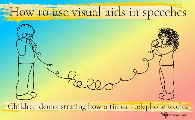
In summary, learning how to use props well will enhance how the audience receives your speech.
Visual aids give power to presentations
On a personal note I coached senior high school students (17-18 years) through major end of project speeches for several years.
At the school I was teaching in each student chose a topic or theme to explore in depth over the course of their final year. They were expected to examine their subject theoretically, practically and artistically.
The process had a written component- a report documenting their study findings, a practical component (what they did to bring the knowledge into reality), a display (which showed off their practical work as well as their artistic), and a final speech which they gave to the school community. These presentations were a high point of school year and the hall was always filled until it could fit no more.
I remember clearly those students whose presentations were made more powerful through their use of props. I saw video clips of cars that had been built and driven. And likewise, microlight aircraft, extraordinary bicycles, and revolutionary skateboards.
I saw mime performances integrated into a speech. I remember clothes being modeled, live science experiments, excerpts from anthologies of short stories read aloud, pianos played, and songs sung. There was even a live demonstration of breaking in a horse on the school's playing field.
Those speeches covered the spectrum in terms of subjects. What made them live, aside from their passion filled delivery, was the care that had been put into choosing and working with props.
* Props is a shortened form of the word 'properties'. Props are anything used to enhance a presentation. The term originally came from live theater and covered any object (property) used by an actor on stage as part of their performance.
Looking for reliable evidence
Here's an aside that rapidly became a warren full of rabbit holes to go down. I looked for verifiable research showing unequivocally that using visual aids boosted a presentation's believability.
I found the same 'studies' and the same compelling 'extracts' from them quoted over and over again.
This was the quote I really wanted to source. 'According to a 1986 3M-sponsored study at the University of Minnesota School of Management visual aids are 43% more effective than text in persuading audience members to take a desired course of action'. But I could not find the original study, anywhere. Mmm. Perhaps it was a fabrication from a clever marketer who understood the power of names of prestigious universities coupled with statistics?
